Design the Data, Don't Just Read It.
Vokaruj Digital Studio translates complex information into visual narratives. We equip organizations with the literacy to interpret trends and the tools to communicate insights with clarity.
A Framework for Visual Clarity
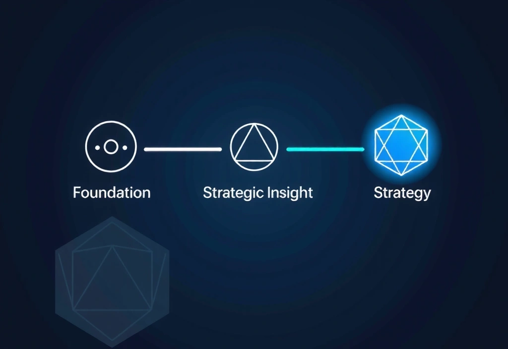
Effective information design is a disciplined process, not artistic guesswork. Our methodology is built on three non-negotiable pillars that ensure every visualization serves a precise strategic purpose.
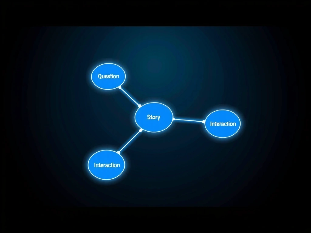
Constraint Definition
We start by identifying the exact question your data must answer. This prevents the common trap of creating beautiful but purposeless graphics.
Narrative Sequencing
We structure visual information like a story, guiding the viewer’s eye through a logical flow from context to detail to implication.
Interactive Fidelity
Whether static or interactive, every layer of complexity must earn its place. We advocate for simplicity, using interactivity only to reveal deeper truth.
Your Team's Learning Path
We offer structured educational experiences to build sustainable data literacy, tailored to your organization's maturity and objectives.
Program Structure
Data Literacy for Executives
A strategic overview for leadership. Learn to ask the right questions of your data team and interpret visual reports for decision-making.
Information Design Mastery
Deep-dive into visual narrative construction. Participants build a portfolio of custom visualizations using industry-standard tools and our proprietary framework.
Custom In-House Curriculum
We design and deliver tailored training using your own datasets and case studies, ensuring immediate relevance and practical application.
"We had months of operational data but couldn't see the bottleneck. After the 'Information Design' workshop, our team sketched a flow diagram in an hour. The root cause was immediately clear: a single approval step was causing a 40% delay. We redesigned it, and processing time dropped by half."
Context: A manufacturing operations team with rich data but no visual analysis skills.
Intervention: A 5-day intensive workshop focused on process mapping and visual hypothesis testing.
Outcome: Tangible process optimization driven by internal visual literacy, not external consultants.
The Bespoke Research Engine
For challenges requiring deep inquiry, we operate as an external research arm. We gather data, identify trends, and craft the narrative that explains what it all means. Our reports are not dashboards—they are documented intellectual journeys.
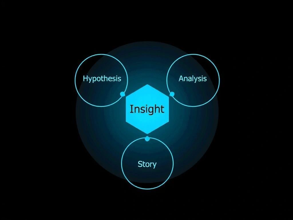
Discovery & Hypothesis
We begin with your business question and form testable hypotheses about market behavior or operational patterns.
Data Sourcing & Curation
We identify relevant public datasets, conduct targeted surveys, or structure your internal data for analysis.
Narrative Visualization
The final report is an annotated visual story, guiding stakeholders from raw observation to strategic recommendation.
Why Visualizations Fail
Effective communication is fragile. Most failures happen before the first data point is plotted. Recognizing these patterns is the first step toward avoiding them.
The "Kitchen Sink" Fallacy
Including every metric because "it's available." This creates cognitive overload. How to avoid: Ruthlessly edit to one core question per visualization.
Chart-Type Tunnel Vision
Defaulting to a bar or pie chart without considering the narrative. How to avoid: Start with your story, then choose the form that supports it.
Missing the "So What?"
Presenting data without connecting it to decision or action. How to avoid: Every chart must be followed by an explicit implication.
Ready to Reframe Your Data?
Whether you need to upskill a team or commission a deep-dive research project, we're here to discuss the challenge. All educational inquiries receive a response within 48 hours.
Contact the Studio30 St Mary Axe, London EC3A 8BF
+44 20 7183 5294
contact@vokaruj.com